The Windows 11 Start menu got its biggest makeover since the operating system launched back in October 2021. And honestly? It was long overdue.
Microsoft has unified the old Pinned, Recommended, and All apps panes into a single scrollable surface, added Category, Grid, and List views for app discovery, tucked a Phone Link panel right next to Search, and finally given us the option to hide the Recommended section completely.
I’ve been using the new Start menu on my own Windows 11 25H2 machine and have walked through every setting it adds and changes. In this guide, I’ll show you what’s actually new, how each feature works, and which settings let you customize the menu to fit your workflow.
You’ll see how to switch between Category, Grid, and List views, expand the Pinned section, use the new Phone Link panel, and hide the Recommended section completely if you don’t want it.
Whether you’ve already seen the new Start menu or are still waiting for it to roll out, this guide gives you everything you need to use it confidently.
Table of Contents
What's New in the Windows 11 25H2 Start Menu (At a Glance)
Before we go step by step through each feature, here’s a quick overview of everything that changed. For Microsoft’s official take, you can also cross-reference Microsoft’s documentation on customizing the Windows Start menu.
The Five Big Changes
- A single scrollable layout. The old three-page design is gone. Pinned, Recommended, and All apps now live on one continuous scrollable surface.
- Three app views. The All apps section now offers Category, Grid, and List Pick your preference, and Windows remembers it.
- Phone Link panel inside Start. A new button next to Search opens a collapsible panel showing recent activity and shared files from your connected Android or iOS device.
- Hide the Recommended section completely. For the first time since Windows 11 launched in 2021, you can turn off the Recommended section entirely.
- Rebuilt Settings page. The Personalization > Start page is now organized into three groups: Recommended, All, and Other.
Who Gets the New Start Menu
The redesign ships to Windows 11 versions 25H2 and 24H2, starting with builds 26200.7019 (25H2) and 26100.7019 (24H2). It first arrived through KB5067036 (October 2025) and expanded broadly with KB5074109 (January 2026 Patch Tuesday).
This is a phased rollout, which means two identical PCs on the same build can still show different behavior depending on when Microsoft flips the switch. If you’re on the right build but don’t see the new menu yet, you’re not doing anything wrong. I’ll show you how to check in the section further down.
Now, let’s walk through each feature step by step.
The Unified Scrollable Layout Explained
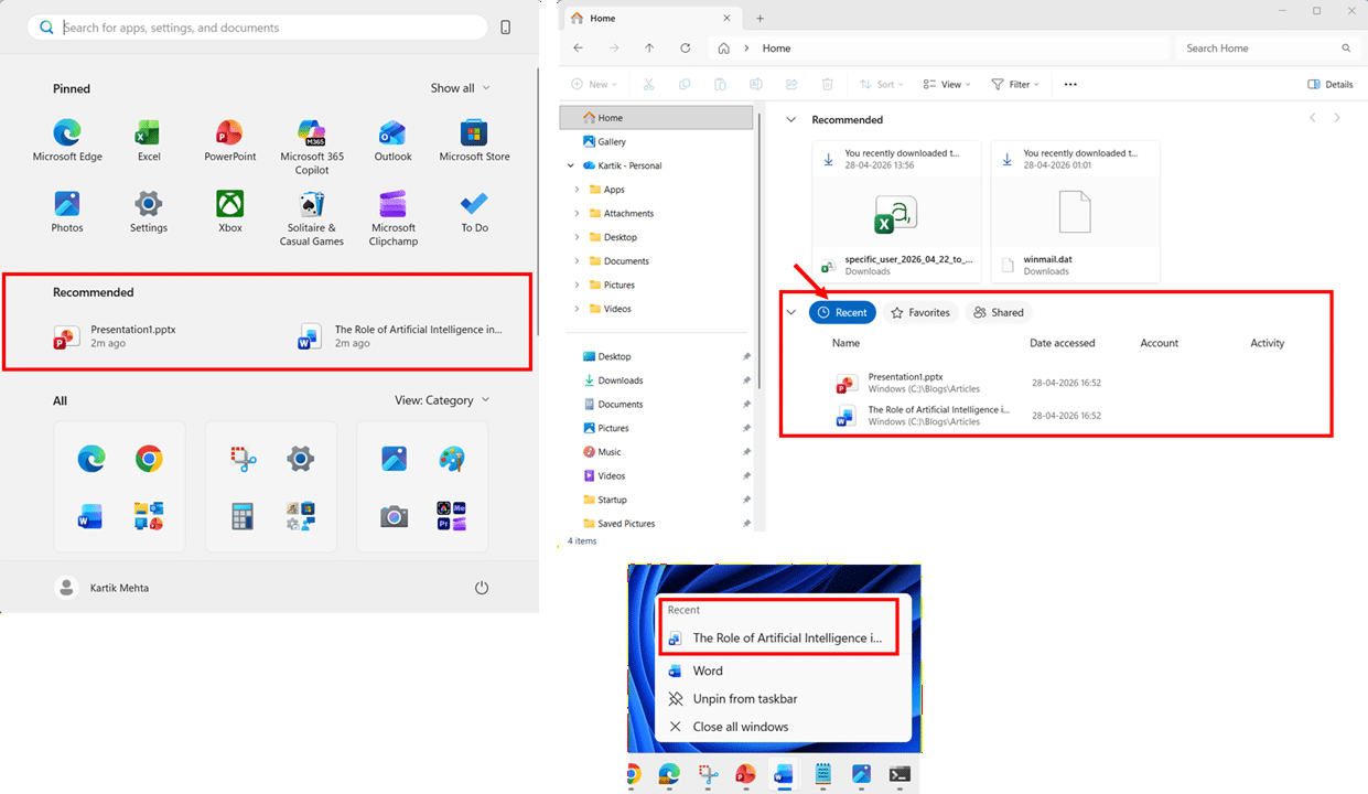
The biggest change in the new Start menu is structural: Pinned, Recommended, and All apps now sit on a single scrollable surface. No more clicking All apps in the top-right corner to jump to a separate page.
How the New Layout Is Organized
When you open Start, you now see three zones stacked vertically:
- Pinned at the top: two rows of app icons by default
- Recommended in the middle: recent files and suggested apps (can be hidden completely)
- All apps at the bottom: your full application list in Category, Grid, or List view
Scrolling down flows through all three zones seamlessly.

How to Expand Your Pinned Apps
By default, the Pinned section shows two rows (up to 8 pins per row on larger displays, 6 per row on smaller ones). If you have more pins, a Show all button appears in the top-right corner of the Pinned section. To always see every pinned app expanded:
- Press the Windows key to open the Start menu.
- Click Show all in the top-right corner of the Pinned section to expand it fully.

- Close and reopen Start to confirm the Pinned section remains expanded. Windows remembers your last view.

If you also want quick access to your most-used apps from the taskbar instead of opening Start each time, see my guide on how to pin apps to the taskbar in Windows 11.
What to Know
- The menu footprint is larger. The new Start menu takes up more vertical screen space than the old design. On smaller laptops, this can feel dominant.
- High-DPI scaling. In multi-monitor setups with different DPI settings, the Start menu adapts to each display.
Note: There is currently no manual resize handle for the new Start menu. If the larger footprint feels overwhelming on smaller displays, your best options are to hide the Recommended section (covered further down)
Next, let’s look at the three new ways to view your apps.
The Three All Apps Views: Category, Grid, and List in Windows 11 25H2 Start Menu
The All apps section now offers three view modes. Windows remembers your last selection, so you only need to switch once.
How to Switch Between All Apps Views in Windows 11 25H2 new Start Menu
- Open the Start menu and scroll down to the All section.
- Click the View dropdown on the right side of the All heading, then select Category, Grid, or List to instantly change the layout.

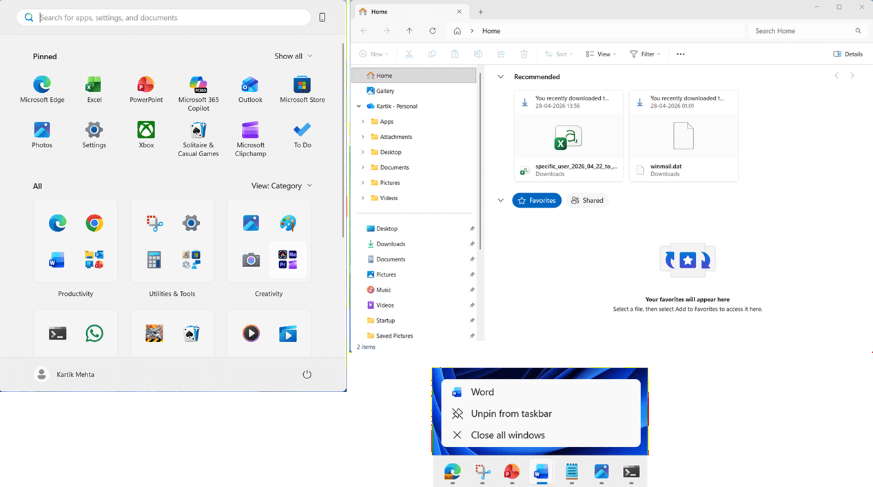
Category View (Default)
Category view automatically groups your apps into labeled buckets based on app type.
The Start menu uses these eight categories:
- Productivity: Browsers, Office apps, email, File Explorer, Copilot
- Utilities & Tools: Settings, Calculator, Snipping Tool, Clock
- Creativity: Paint, Camera, Photos
- Games: Installed games
- Entertainment: Netflix, Prime Video, media players
- Accessibility: Magnifier, Live captions, Narrator
- Information & Reading: Weather, MSN, Maps
- Other: anything Windows can’t categorize

Category view works particularly well when:
- You think in terms of tasks (“I want to edit a video” or “I want to manage storage”) rather than remembering exact app names.
- The device has a broad mixture of work, gaming, and media apps where alphabetized lists get overwhelming.
- You are on a touch‑first or casual‑use device and prefer larger, thematic app clusters rather than dense lists.
Note: A category only appears when you have at least three apps that match it. Apps with fewer than three matches get moved into Other, so don’t be surprised if an expected category is missing on a fresh install
Grid View
Grid view displays apps as alphabetical tiles in rows and columns, with letter headers (A, B, C, and so on) separating each section. Click any letter to jump directly to that part of the alphabet.
Grid view is most effective when:
- You have many installed apps and don’t want to scroll through a long vertical list.
- You are on a large monitor or ultrawide display where the extra width would otherwise be unused.
- You recognize apps more quickly by their icons than by their exact names.

List View
List view is the classic compact vertical list, ordered alphabetically from A to Z. It’s the same style you’d recognize from earlier Windows 11 builds and Windows 10.
List view shines when:
- You remember exact app names (for example, “Event Viewer” or “Hyper‑V Manager”) and want predictable, alphabetized navigation.
- You are in IT, support, or admin roles and routinely jump into less common tools that you don’t want pinned.

The New Phone Link Panel Inside Start Menu
The 25H2 new Start menu now has a Phone Link panel built right into it. Once your phone is paired, you can glance at messages, calls, photos, and battery status, plus send files to your phone, without ever leaving Start Menu.
What the Phone Link Panel Shows
When expanded, the panel displays content from your paired Android or iPhone, as documented in Microsoft’s Mobile device in the Start menu guide:
- Battery and connectivity status at the top
- Quick access buttons for Messages, Calls, and Photos
- A Recent section showing your latest texts, phone calls, and images
- A Send files button at the bottom for drag-and-drop file transfer from your PC
For Android users, the panel also supports screen mirroring with a single click on supported phones, and you can access your phone’s File Explorer directly.

How to Toggle the Phone Link Panel from Start
A new phone icon next to the Search bar in Start is the quickest way to show or hide the Phone Link panel. This button is new to the 25H2 Start menu.
- Press the Windows key to open the Start menu.
- Click the small Mobile device (phone) icon on the right side of the Search bar to expand or collapse the Phone Link panel.
Note: You need to pair your phone first. The Phone Link panel only appears after you’ve set up Phone Link via the Phone Link app or Settings > Bluetooth & devices > Mobile devices. If you haven’t paired a phone, the icon won’t do anything useful.
Note: If you don’t use Phone Link at all, you can hide the entire feature (including the new icon next to Search) in Settings > Personalization > Start by switching off Show mobile device in Start.

Hide the Recommended Section Completely
Ever since Windows 11 launched in 2021, one of the loudest user complaints has been the inability to truly get rid of the Recommended section. In older versions, even after turning off all recommendation-related toggles, the section would remain visible on the Start menu as an empty placeholder. In 25H2, Microsoft has finally fixed this.
How to Hide the Recommended Section Completely
- Press Windows + I to open Settings.
- Select Personalization from the left sidebar, then click Start.

- Under the Recommended group, toggle off Show recently added apps.
- Toggle off Show recommended files in Start, recent files in File Explorer, and items in Jump Lists.
- Toggle off Show recommendations for tips, shortcuts, new apps, and more.

- Open the Start menu to confirm the Recommended section has disappeared entirely, leaving only Pinned and All apps.

One Toggle, Three Places Affected
The toggle Show recommended files in Start, recent files in File Explorer, and items in Jump Lists is a single master switch with wider reach than it appears.
Three separate surfaces (Start Menu‘s Recommended section, File Explorer‘s Recent view, and taskbar Jump Lists) all pull from the same underlying recent-activity list Windows maintains. Turning this one toggle off disables that list entirely, so recent files vanish from all three places simultaneously.
Follow these steps to see the cascading effect on your own machine before you decide whether to leave the toggle off:
- Open a few documents, images, or folders normally so Windows can build up some recent activity to observe.
- Press the Windows key to open Start and confirm the Recommended section shows your recent files.
- Open File Explorer (Windows + E), click Home in the left sidebar, and confirm the Recent section lists your recently opened files.
- Right-click any pinned app icon on the taskbar (for example, File Explorer or Word) to open its Jump List, and confirm it shows recently opened items.
- Press Windows + I to open Settings, go to Personalization > Start, and toggle off Show recommended files in Start, recent files in File Explorer, and items in Jump Lists.

- Reopen Start, File Explorer‘s Home view, and any taskbar Jump List. All three will now show no recent items, confirming they share the same source.
Important: There is currently no way to hide the Recommended section in Start while keeping Recent files working in File Explorer or Jump Lists. If you rely on right-click Jump Lists on the taskbar or use File Explorer‘s Recent view daily, consider leaving this toggle on and disabling only the other three toggles to keep your recent activity intact elsewhere.
Next, let’s look at the rest of the new personalization options now available in the 25H2 new Start menu.
New Personalization Options for the New Windows 11 25H2 Start Menu
Alongside the Start menu redesign, Microsoft also overhauled the Settings > Personalization > Start page itself. This is where you’ll find every toggle to customize your new Start experience, and the page looks quite different from what you might remember from older Windows 11 versions.
What is Removed in New Start Menu
If you’ve used Windows 11 22H2 or 23H2, you may remember a layout selector at the top of the Start settings page offering three preset layouts:
- Default: Balanced mix of pinned apps and recommendations
- More pins: Larger Pinned section, smaller Recommended
- More recommendations: smaller Pinned section, larger Recommended
In 25H2, this three-layout selector is gone. The new unified scrollable design makes those preset balances irrelevant, since you now control expansion behavior directly through individual toggles like Show all pins by default and the four Recommended group toggles.
The New Three-Group Settings Layout
Opening Settings > Personalization > Start in 25H2 now presents toggles organized into three clear groups:
Recommended group
This group controls everything that can appear in the Recommended section of the Start menu. Toggling all three off removes the Recommended section entirely (covered in the Hide the Recommended Section walkthrough earlier in this guide):
- Show recently added apps: Surfaces newly installed applications.
- Show recommended files in Start, recent files in File Explorer, and items in Jump Lists: The master switch demonstrated earlier
- Show recommendations for tips, shortcuts, new apps, and more: Microsoft Store and tip suggestions.

All group
This group controls behaviors tied to the unified Pinned + All apps layout that 25H2 introduced:
- Show most used apps: controls a Most used section that displays up to 6 of your most frequently used apps. In Grid and List views, this appears as a separate row at the top of the All. In Category view, there is no dedicated Most used row; your most frequently used apps simply appear at the top of whichever category they belong to.

Other group
This is where Microsoft puts everything that doesn’t fit cleanly into the Recommended or All groups:
- Show mobile device in Start: shows or hides the new Phone Link panel and the mobile icon next to Search.
- Show account-related notifications: controls account banner messages near your profile in the bottom rail.
- Folders: opens a sub-page where you choose which shortcuts (Settings, File Explorer, Documents, Downloads, Music, Pictures, Videos, Network, Personal folder) appear next to the Power

If you also want quick access to specific files, folders, or websites from outside the Start menu, see my guide on how to create a shortcut on desktop in Windows 11.
Conclusion
The redesigned Start menu in Windows 11 25H2 is the biggest change to how you launch apps and open files since Windows 11 first shipped in 2021. The unified scrollable layout, the three view modes for All apps, the Phone Link panel, and the option to hide the Recommended section completely all work together to give you a cleaner, more flexible experience once you know where everything lives.
Have a question about the new Start menu I didn’t cover, or noticed something working differently on your machine? Drop a comment below, and I’ll do my best to help. The more real-world feedback I get from readers, the better the next guide gets.
Frequently Asked Questions (FAQs)
Yes for Home and Pro editions running version 25H2 or 24H2 with the required cumulative updates. Enterprise and Education editions also receive the redesign, although IT-managed devices may have it suppressed by Group Policy or Intune layout policies. Windows 11 IoT Enterprise LTSC 2024 is based on 24H2 and can receive the new Start menu through the 25H2 enablement package, but feature availability depends on update channel and configuration.
No. Windows 10 reached the end of mainstream support on October 14, 2025, and Microsoft is not backporting the redesigned Start menu to it. Users on Windows 10 who want the new design will need to upgrade to Windows 11 version 25H2 or 24H2 on a supported device.
No. Category view is automatic and offers no manual controls. You cannot rename categories, create custom ones, or move apps between them. Microsoft has acknowledged user feedback on this limitation but has not committed to adding customization controls. If automatic grouping doesn’t work for your app set, switch to Grid or List view from the View dropdown for deterministic alphabetical ordering.
The new Start menu shows the first two rows of Pinned apps by default and adds a Show all button in the top-right corner of the Pinned section if you have more pins than fit in those rows. Click Show all once, and Windows remembers the preference, keeping Pinned fully expanded the next time you open Start.
The separate All apps page is gone, replaced by the unified scrollable layout. There is no longer a dedicated All apps button. Instead, the All section sits directly below Recommended on the same scrollable surface and uses a View dropdown on the right to switch between Category, Grid, and List layouts.
